ITC 7. Beauty
Plus portfolio-making, characters and recommendations
Hi, friend. The warm summer evenings bring back memories of my youth, when days seemed endless, and vacations, enormous periods of time after which you returned to school slightly transformed. Now these days fly by and change seems to require more time and effort…
→ Reflections
I like my apartment, but most people who know me know that I live in one of the ugliest neighbourhoods of one of the most average (bland) cities in Spain. It's not charismatically ugly. Or representatively ugly. Or curiously ugly. No, it is the worst kind of ugliness: the anodyne one. The one that can’t awaken any type of emotion or sensation in you, beyond visual tedium-induced distress. Only a nice park in front of us saves us.
I have spoken with many friends about the effect of going outside and finding yourself in an environment that somehow invites you to walk, to escape, to make a few minutes in silence become something restorative.
When I wake up next to the sea on our very short annual vacation on the coast, I think of my neighbourhood. And in how it embraces me every day with its worn facades, its contamination, the impossible irregularity of its buildings and the enormous canal that crosses its most important avenue, butchering it, full of weeds, dirt and asphalt.
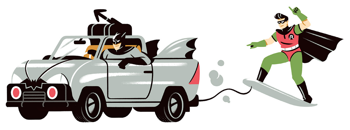
When I walk with my wife through our streets, we usually joke about how 'beautiful' everything around us is. After years, this is affecting me a little, especially when I’ve been working at home intermittently for more than a decade, and the outside is as important (or more) than the inside.
In my opinion, living surrounded by a certain beauty is necessary. Let it seem that what awaits you out there was touched, at least lightly, by a certain grace, even in its humility.
(Slightly) Renewed portfolio!
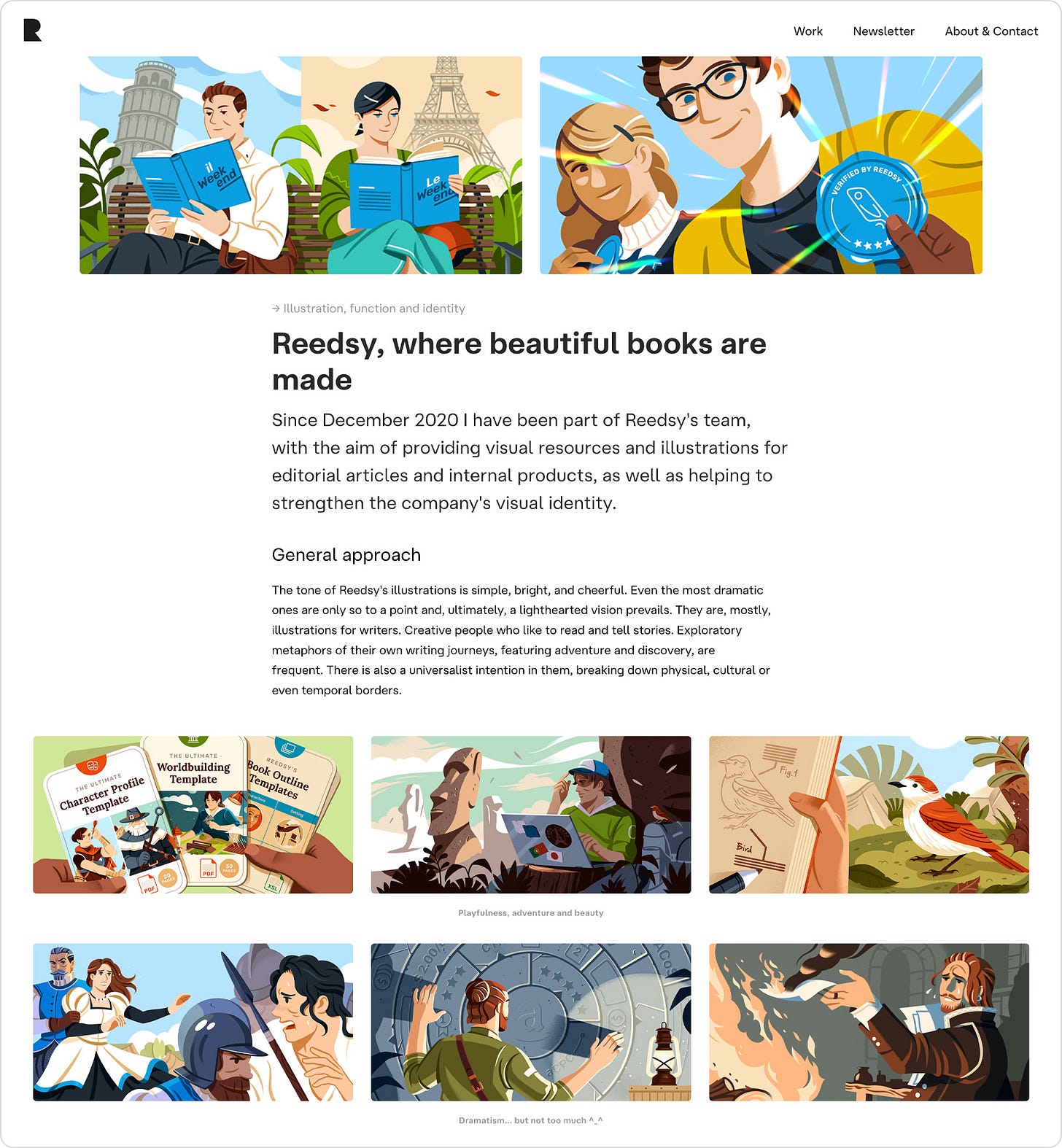
I like to keep my portfolio fresh, so I generally make changes throughout the year. They’re generally small, but making them is quick thanks to Semplice. This year I wanted to basically simplify the home page. So this is a short summary of some decisions, including reflections around portfolios:
Home page
I never loved portfolios based on a mosaic of thumbnails providing access to independent projects, because that way ONE image has to speak for the whole project. And it can be unfair sometimes if they’re full of interesting pieces, and especially because people don’t have the patience to navigate portfolios these days.
So I always preferred showing independent pieces one after the other, as if it was a short reel in scroll form. However, this forces us to lose order. Plus, most of my projects make more sense precisely as that, full projects, not individual pieces. So my solution right now is this:
One small block presenting the project.
Accompanied by a short selection of images.
Plus a simple CTA.
And for now, just three (on-going) projects visible in the home page. Even if these blocks can’t talk for the whole projects, they provide more than a single thumbnail.
About section
As for the about section, I’ve kept the same structure for some years now:
Photo of me and my working space. Why: people like to see other people’s faces. It humanises you. (Not visible on mobile)
A two-sentence intro with a direct CTA. Why: states what you offer plus proposes a clear action.
A block describing my work. Why: along with the bio part, you get to explain what you and your work are about, in essence.
A block with a short bio.
Final CTA + Some contact links.
Independent project pages
Untouched, for now. My project pages can be long, with a considerable amount of text. Although images have clear importance, I like to explain my projects, and I use as many sections as I need.
Some people might find them too long, but I assume that whoever is reading the project has come to go into detail. For everything else we have the home page or lighter posts on Dribbble or this newsletter:
All images are relatively big (around 1000px width) but exported with a JPEG quality of 60. By the way, I’ve been using AT Haüss by Arilla Type for a while now. These guys know how to design good, affordable typefaces.
→ Sharing thoughts
AI & Tobias van Schneider
I really like Tobias and the work and products he’s developed in the past years (Semplice, MyMind…). I also love his articles. He recently wrote one around AI, and here’s an excerpt I’d like to recover:
Will I miss the old and golden days of design? Absolutely, I already do. I'm a romantic. And I'm sure due to my passion I will continue designing the old way, but I already know that the new "AI assisted designer" will pass me in the coming years.
I don't believe this is because AI will become necessarily better at designing, I just believe it will become faster and more efficient at it. And in a society in which we value quantity over quality, an AI will always win. It's the name of the game.
But also, and more importantly, this one:
I truly believe there will be a counter movement, and I can promise you I will be at the forefront of it. Not because I hate AI and automated systems, but because I love to build beautiful, human experiences. I'm old fashioned that way.
Most importantly, I believe that this new counter movement will be pushed by the younger generation as well, the same generation that is now fueling the AI movement. You live, and you learn. Motivated by a sort of nostalgia for a time they've never experienced, they'll bring back older values again. It's like a pendulum that swings. At least that's my optimistic outlook.
Read the full article here: AIAIAI by Tobias van Schneider
New mixed character
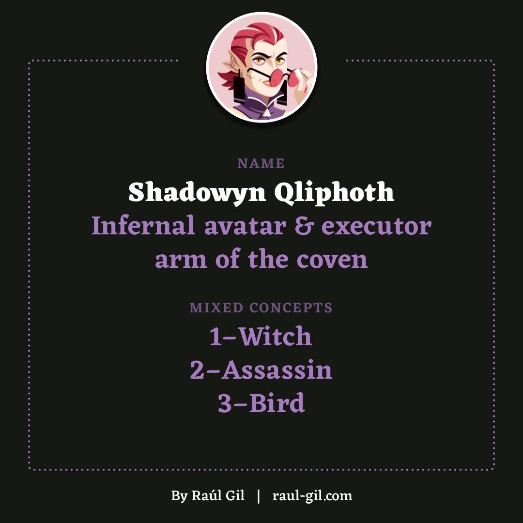
This project keeps progressing, little by little. You can read here the premise of the whole exercise. And here’s the next step! Our new friend is Shadowyn Qliphoth, combining the following randomised concepts: Witch, Assassin and Bird.
At first I thought of just developing a witch that had control over multiple birds that she used as killing acolytes. But the global concept was, in the end, essentially a witch.
So I decided to mix two of the concepts: assassin and witch, and then introduced some bird-like attributes that could tie all the lore around the character.
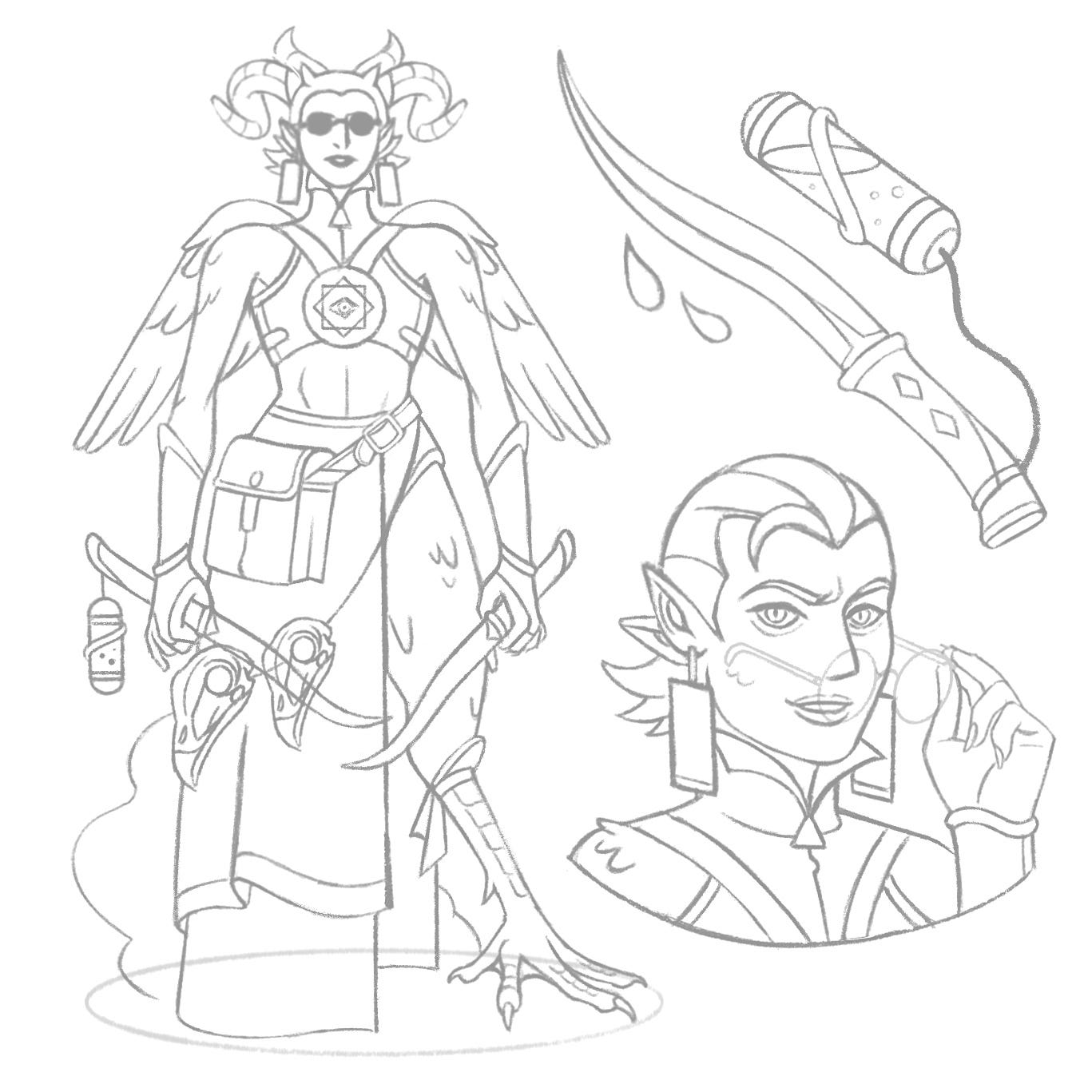
Here’s the backstory, my favourite part:
“Shadowyn’s mother, a powerful witch, made an unholy pact with the demon Malphas. The fruit of that agreement was her own daughter, who is at once an avatar of the demon on earth, a witch by blood, and a ruthless protector of her entire clan. The ultimate combination of martial skill and dark magic.”
Some points:
Her surname references the hermetic cabalistic term Qliphoth.
Shadowyn uses two long daggers, one imbued with shadows, another smeared with poison.
Her skin is covered with soft feathers, she has bird-like legs and wings, and a particularly long neck. She also has four ears (the inspiration for this coming from Yu Yu Hakusho’s demon Yomi).
Although she doesn’t look human, her gaze can enchant anyone who looks at her, and she is as lethal with her weapons as with her spells.

As always, available as a print in various formats on Inprnt. If you need more witches with bird-like attributes in your life, watch The Owl House, a great animated series.
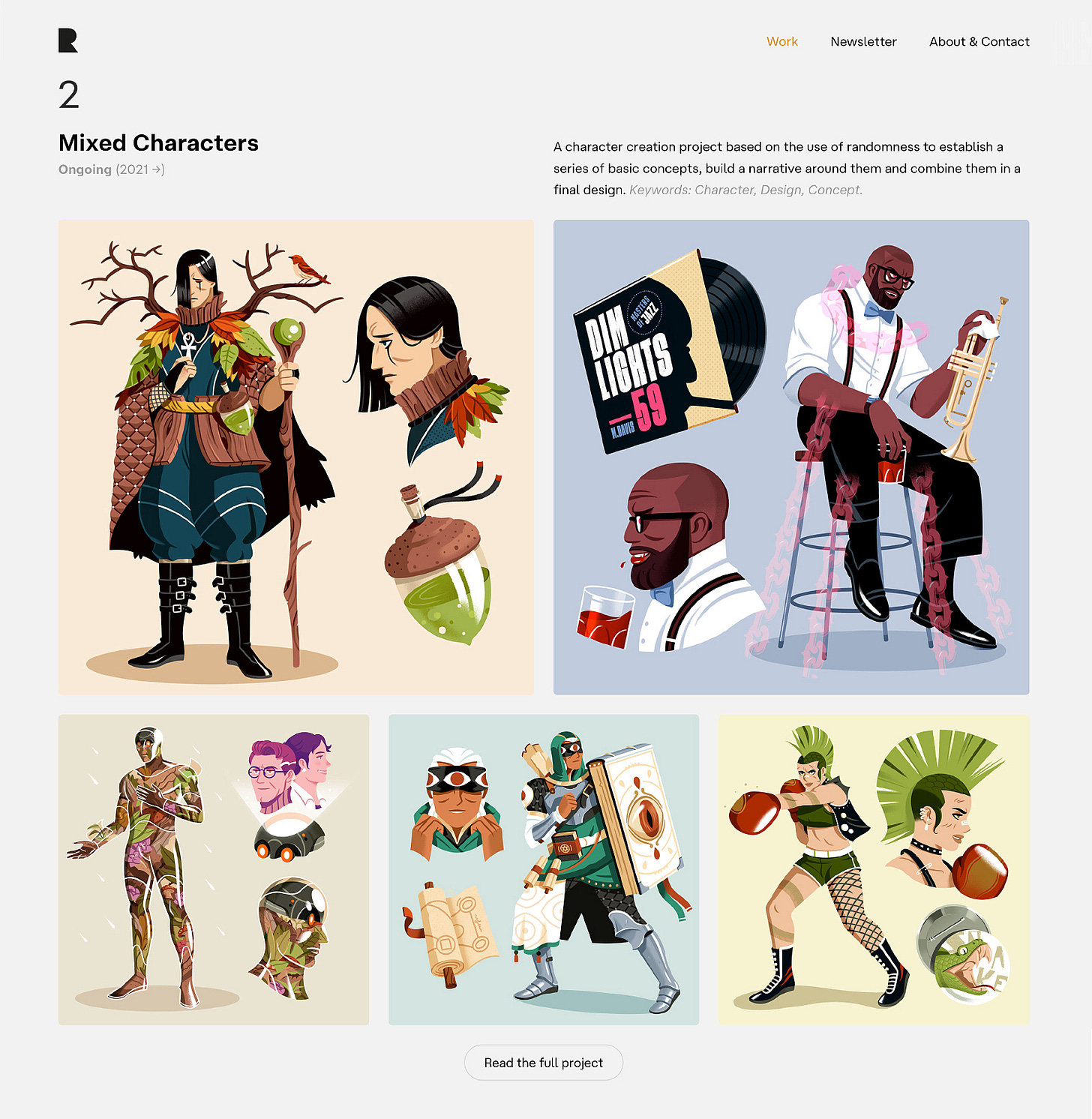
Note → Take a look at the case study in which you’ll find all the examples developed so far, accompanied by some reflections. More characters (slowly) coming.
Recommendations
A product: Light Phone III
What a beautiful little thing. A simple, digital phone, with:
A matte screen and a B/W typographic interface
Its own OS
A replaceable battery
A camera
GPS
A simple music player, alarm, timer, calendar and voice memo
That’s all. Light (124g) and distraction-less. Even its dimensions (1080 x 1240px) defy the most adopted ratios.
They also did a good job with their main marketing video, with all its grainy, retro vibes that take us to less stressful times. Honestly considering adopting it, since it’s compatible with the most important carriers in my country.
A film: Ultraman Rising
American animator Shannon Tindle’s last project as a director is a tribute and love letter to Ultraman, an intergenerational character who has inspired many artists around the world. The film is packed with details for Ultraman’s die hard fans. The design work on it is at a great level. It’s a shame that it will not receive a theatrical release in all countries, BUT you can enjoy it on Netflix.
Surprisingly, some people didn't like that this is a movie crafting a narrative around parent-child relationships, inherited responsibilities, and growth, rather than just being a bunch of monster fights. I personally loved it. The character design art direction is by Keiko Murayama. We talked about her here.
An artist: Annette Marnat
Annette isn't especially prolific on social media, basically because she's too busy making beautiful things for picture books and top-notch animated films, among other things. Her gorgeous style is frankly inimitable and universally admired, halfway between the purest tradition and the most beautiful contemporaneity.
A musical selection: Minotaur by Cryo Crypt
Cryo Crypt is a sub-label of Cryo Chamber, well known for their highly immersive dark ambient work. Essentially run by Simon Heath, Cryo Crypt is more focused on Dungeon Synth. Meaning: equal high quality, equally ideal for work, equally immersive, but specifically evoking dark fantasy worlds. Most of the pieces from this selection are by Mountain Realm, one of the names behind Heath’s musical work.
A song: Harm by Beacon
Let it in. The bite that breaks the skin. I'm falling back in time. Wondering if you were ever mine. What half will I become? Three days since my last spell. The force that slowly builds. And breaks inside my blood.
Thank you for reading In the Cave. Currently, I’m using social media just to promote this newsletter, share other people’s work or send memes to friends. Nothing else. So if you like this newsletter, please share it and recommend it. You can also find me on my website or Dribbble.
See you next month!
Read a previous story:



Yo sigo teniendo fe en que podremos cambiar lo que no nos gusta más pronto que tarde. Y después de este verano, que casi no lo ha sido, más todavía. Nos lo merecemos y ya nos toca. A ver si el universo se decide a ayudarnos ya, que estamos listos :-D
I love the feeling your newsletters leave me with. It's so encouraging to constantly (re)discover the power of work done with love, values and patience. Humanity needs more Raúl Gil, more people In The Cave.
The little-big changes in the porfolio looks amazing, and the new mixed character is stunning. It reminded me of a question I wanted to ask you: what do you think of the new Batman: The Caped Crusader series?