

→ Reflections
Recent personal events have made me pay special attention to neurodivergence and how stressful or painful it can be to perceive the reality around you when your brain simply works differently. And how very very dangerous a lack of accurate diagnosis can be in some cases.
A recent tweet by David García Miño on X:
It's hard to live in a world that relentlessly advances on anyone who walks at its own pace. Watching it crush those who think differently, those who feel differently, those who are different. Having the opportunity to pave the way for even one person is a victory.
It’s easy to assume that everyone is the same, that we all need the same things, and that we all understand our surroundings in the same way. And we have so little patience... I guess the world is inexorably leading us toward that. To run in a straight line, pushing and shoving, and to look in annoyance at the person stumbling next to you. If we were attentive and compassionate enough to reach out to those people, we would open up a whole new world of possibilities.
How intricate and rich the human mind is, and how fortunate we are that each individual represents a unique expression and form. Let us not work against heterogeneity.
(More) tiny sketches
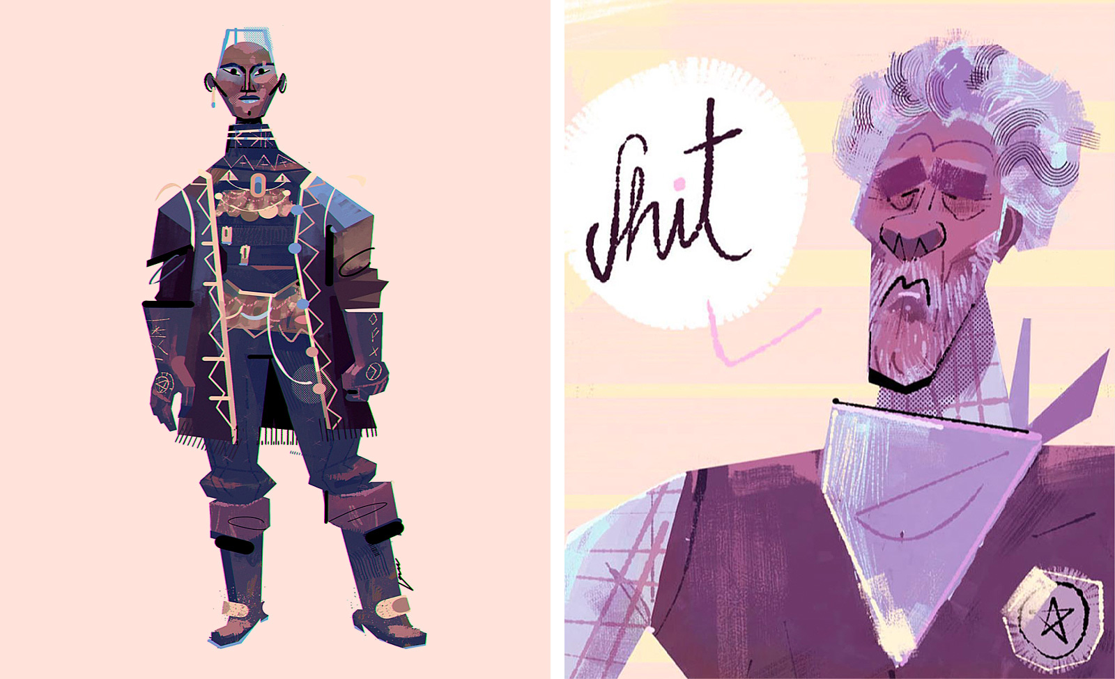
More humble sketches with no real purpose other than experimenting (look at the last ones I shared here). This is, probably, one of the most basic exercises to unlock creativity: just drawing without specific goals or limitations. But it’s easy to get lost in the obligation of professional work. Some recent stuff:
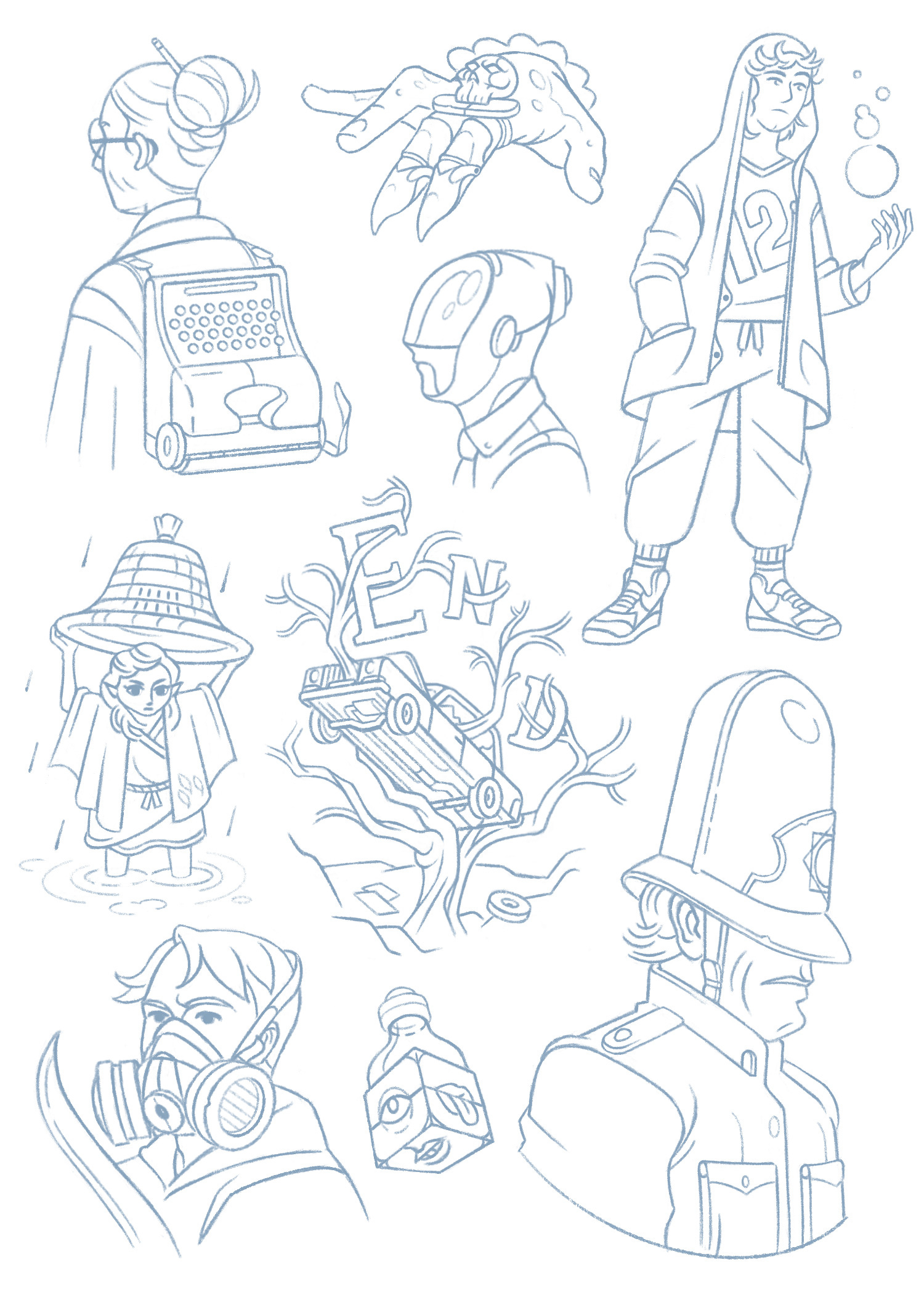
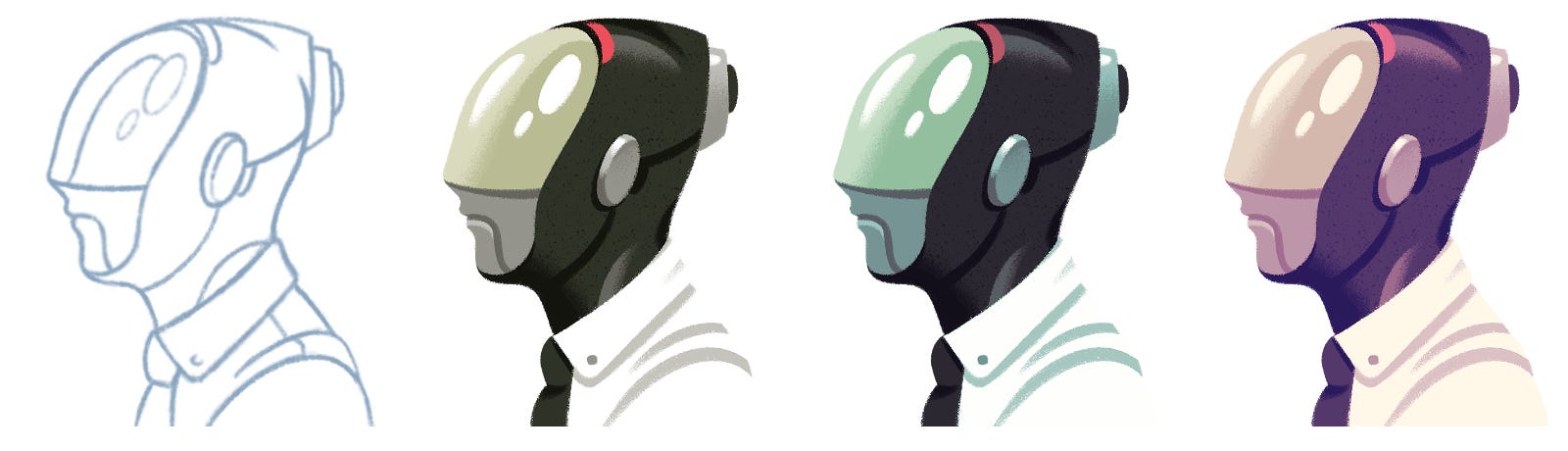
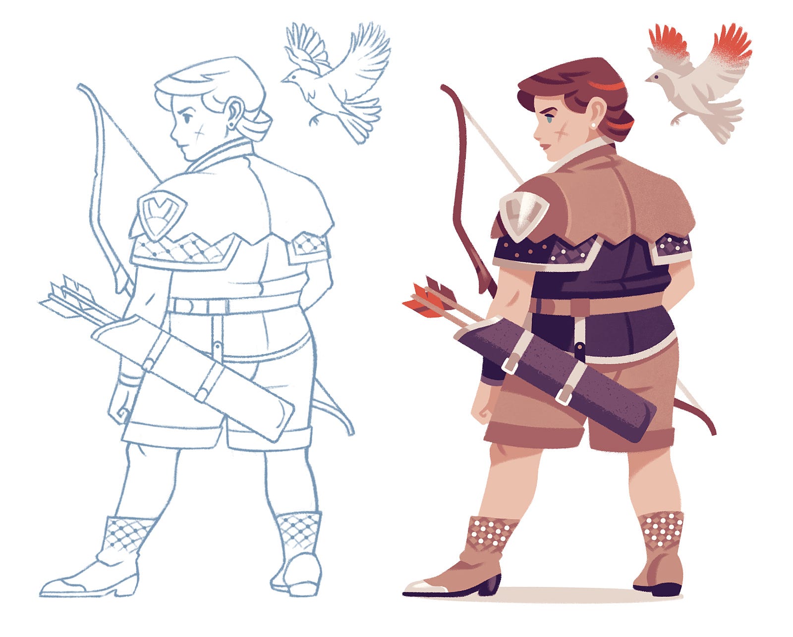
Colouring some of these sketches from time to time is always a good, quick exercise to try new palettes and/or finishes:
More random sketches:
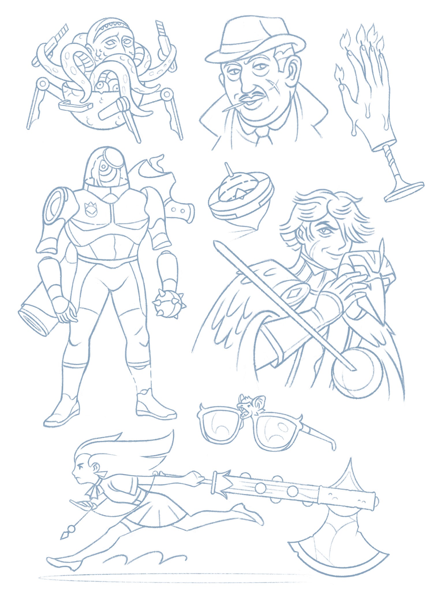
I like to draw little things that could have their own little stories to imagine and develop. I’ll keep sharing more of these as long as you don’t hate them. All of these sketches are (and will be) part of the Playground section on my website. AND there’s something else I’ll do with them. I’ll tell you more in the future.
→ Intermission
Character Design course
Last year, I took a visual development course with Mol, an artist I greatly admire. I usually take at least one annual course to help me develop some skill. This year, I decided to repeat with him, but in a course specifically dedicated to character design, a field in which he is a true expert. Again, one full month, two afternoons-evenings per week. Great experience!
→ A redesigned cover
Placeres
My dear María Latorre, MªCarmen for friends and family, self-published a compilation of eighteen short erotic/romantic stories some years ago. The title was Placeres (Pleasures). And in a few months, the sequel will be released. So it was a good opportunity to re-edit the original text and revisit the cover we created in 2018.
The original proposal
Despite the theme, the covers of the genre seemed so repetitive and uninteresting that we decided to do something different. My proposal arose from two aspects that were clearly present in all the stories, beyond romance or eroticism:
Its strongly feminine approach.
All the stories talked directly or indirectly about inner exploration and self-knowledge.
Previous version
So I thought that depicting a woman opening an interior door, using a key she herself possesses, was an intriguing way to approach the cover. The silhouette was split in two, so that the light seemed to both emanate from within and enter from without.
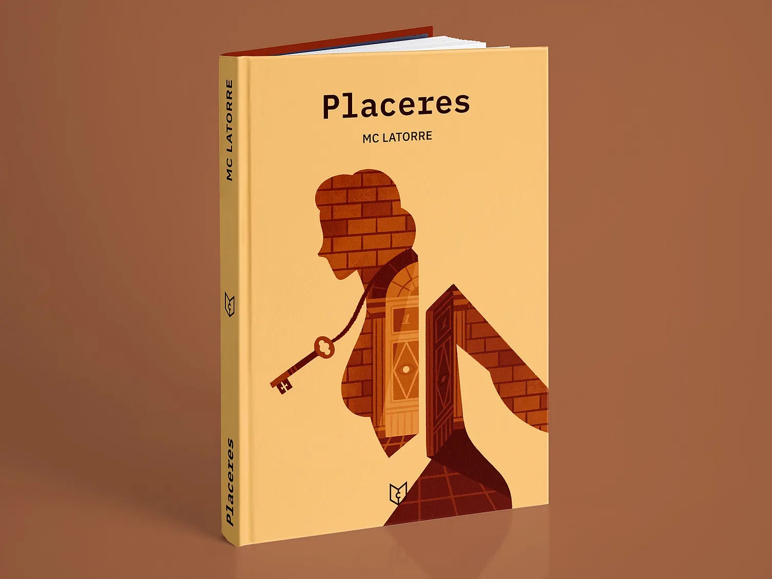
What I still like: The abstract approach, the self-discovery concept, the contrast between the illustration, the flat background, and the clean typography. That it doesn’t follow genre trends.
What I wanted to change: I wanted a better harmony between all the typographic bits, get rid of the full black for the title, use a paler background colour and a slightly less geometric feminine figure, introduce a little bit of sensuality and, above all, create something that could establish a scalable visual dyscourse for the second volume.
New cover
So for the new cover, I decided to use a more humanised figure, with more organic shapes and a frontal posture. While it loses the strong asymmetry of the previous version, it also adds other nuances.
The image still contains an element of mystery and sensuality, but it is serene, harmonious, and elegant and it complements the extremely simple typographic composition.
Now the masses of white are more dominant, generating a lighter image and making the interior wall limited to the visible parts of the skin.
A door opens to the other side of the interior wall, and the whole figure blossoms.
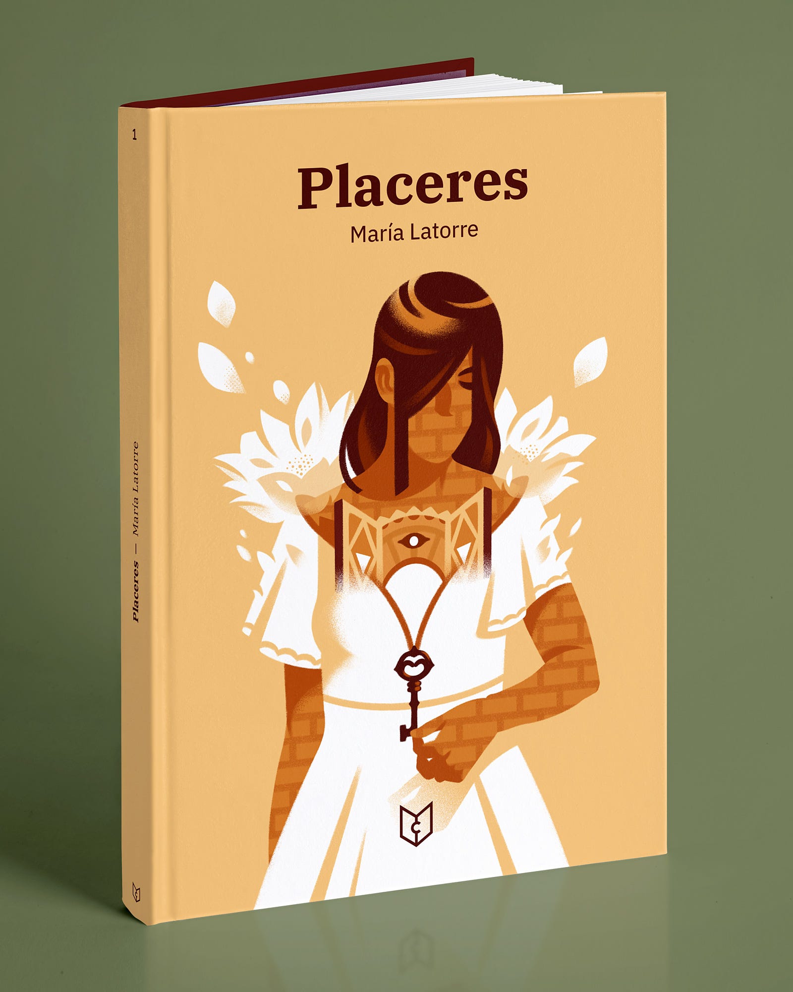
I like the fact that it looks like it could be both a romance book and a book of poems, which I sincerely believe is true to the character of the work. I also like how the key is actually the zipper that uncovers and reveals.
We’ll share soon the cover for the second volume and how both of them live together.
Have fun!
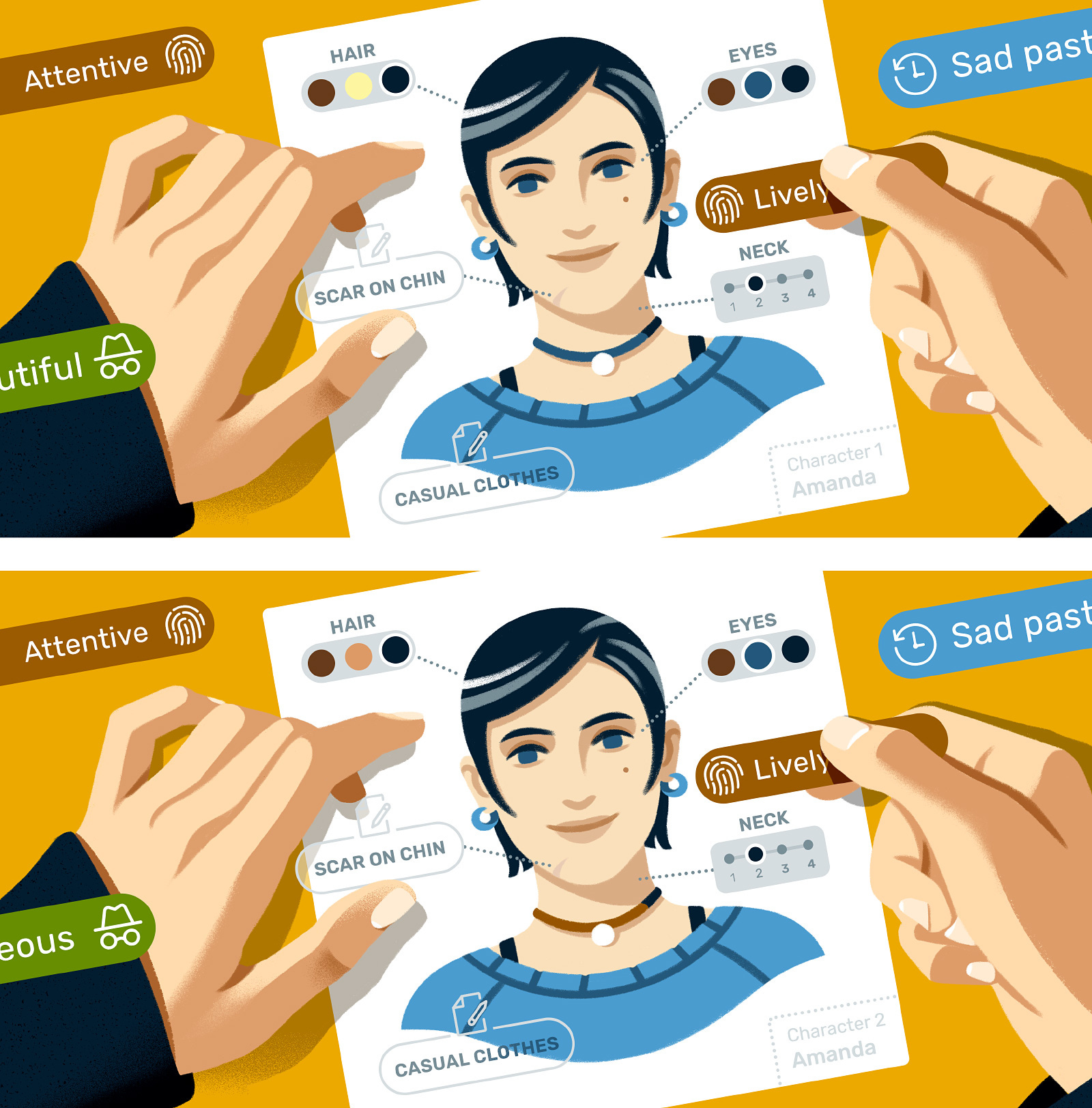
Try to find the 6 differences between these 2 images from a Reedsy article on Direct Characterisation. Extra hard on mobile. You’re warned!
You can also complete your knowledge on direct/indirect characterisation by reading this other article: Indirect Characterization: Definition, Examples, and Tips. For this one we used a header illustration with a concept that I always liked: the definition of a character trough everyday objects associated with it.
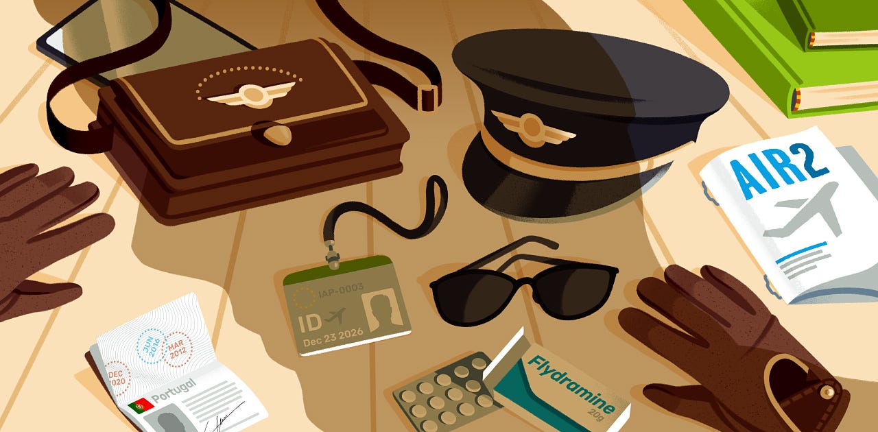
Note: Have you been able to identify the gold broach on the bag as the eye of the person whose shadow is projected onto the image? Yeah, subtle detail. Could have been exaggerated more 😕 The eternal balance between subtlety and straightforward communication…
Thank you for reading In the Cave. Currently, I’m using social media just to promote this newsletter, share other people’s work or send memes to friends. Nothing else. So if you like this newsletter, please share it and recommend it. You can also find me on my website.
See you soon in a Recommendations-only issue!
Read a previous story:

Enjoyed seeing the sketches. Each one was filled with a sense of character. Top stuff!
Really beautiful, the new cover for Placeres. Looking forward to seeing (and reading!) the second volume.