


ITC 11. Adventure
Plus style frames, portraits and more

Hi, friend! Today we have a relatively short one, with only a couple of projects to show, but more in detail than usual. Thanks for reading!
→ Reflections
We’ve watched Adventure Time (2010-2018) multiple times at home. But it’s interesting to revisit series that we watched as a family just a few years ago. Because children grow up quickly, and so do their points of view, perspectives and understanding. And it’s like watching a completely different show now :-)
Adventure Time is, in my opinion, one of the most influential fiction works of the last twenty years. Some people seem to want to revisit it with intellectual or over-analytical intentions, only to end up concluding that it is silly and overrated.
But it was never intended to be anything too complex. It's simply a tender, funny, original, unfiltered prank. A great creative framework with no limits in which everything can fit. Its level of WTFism made the entire sector rethink what the limits of craziness and extravagance (and courage!) were in the world of animation.
I also think it brought a bit of a revival of classic adventure and dungeon exploration. A hail to friendship and the power of creativity, coupled with a cosmology that is both completely new and 100% archetypal.
I am convinced that without Adventure Time some of the most notable animated series of recent times would not have existed: Steven Universe, Gravity Falls, Clarence, Over the Garden Wall, Gumball, OK KO, Craig of the Creek... among many others.
At the same time, even if they’re very different, would have Adventure Time been possible without Donjon by French artists Lewis Trondheim and Joann Sfar? (You can watch all the episodes on Max!)
Style frames
There is a fair amount of artwork we create at Reedsy that is ‘hidden’ in all sorts of pieces, some promotional, some educational… Lately we have been making some nice ones for the YouTube channel, always beautifully animated by Julian Kunchev, whom I affectionately call Juliancín. Thanks for tolerating me, Julian. Here are some frames from recent supporting sequences:

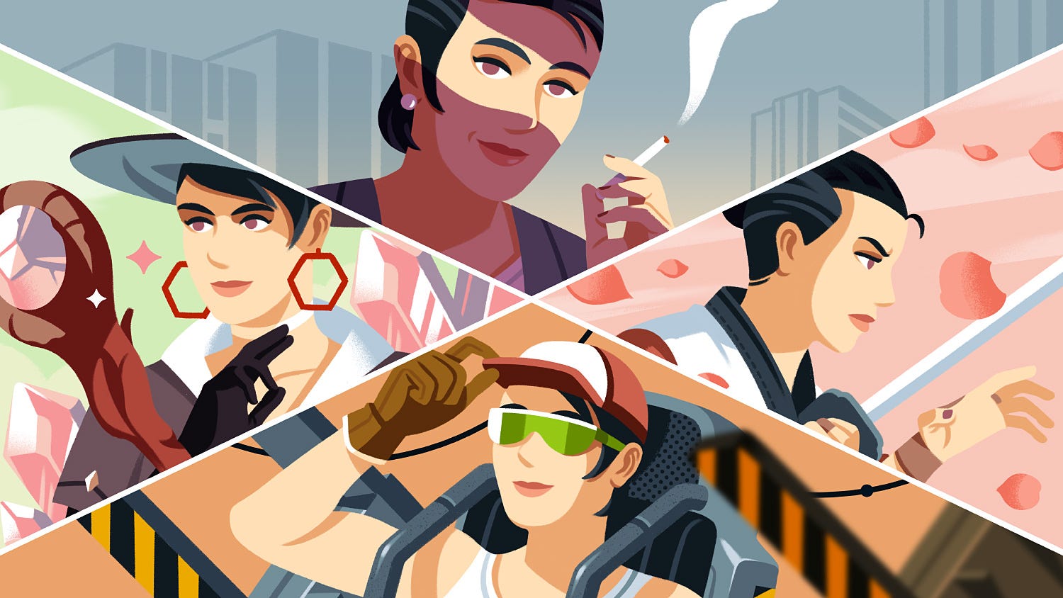
The cool thing about this work is that sometimes we can use a slightly different art direction, depending on the context. Sometimes more complex and dramatic, and sometimes more minimal than usual.
→ From the past
Book spines!
My weird interest in book spines led me to teach a short class on how to use them creatively. For that course, I prepared an example based on a collection of horror and science fiction books, where the design solution was based entirely on their spines. Crazy, don't try this if you want to sell books.
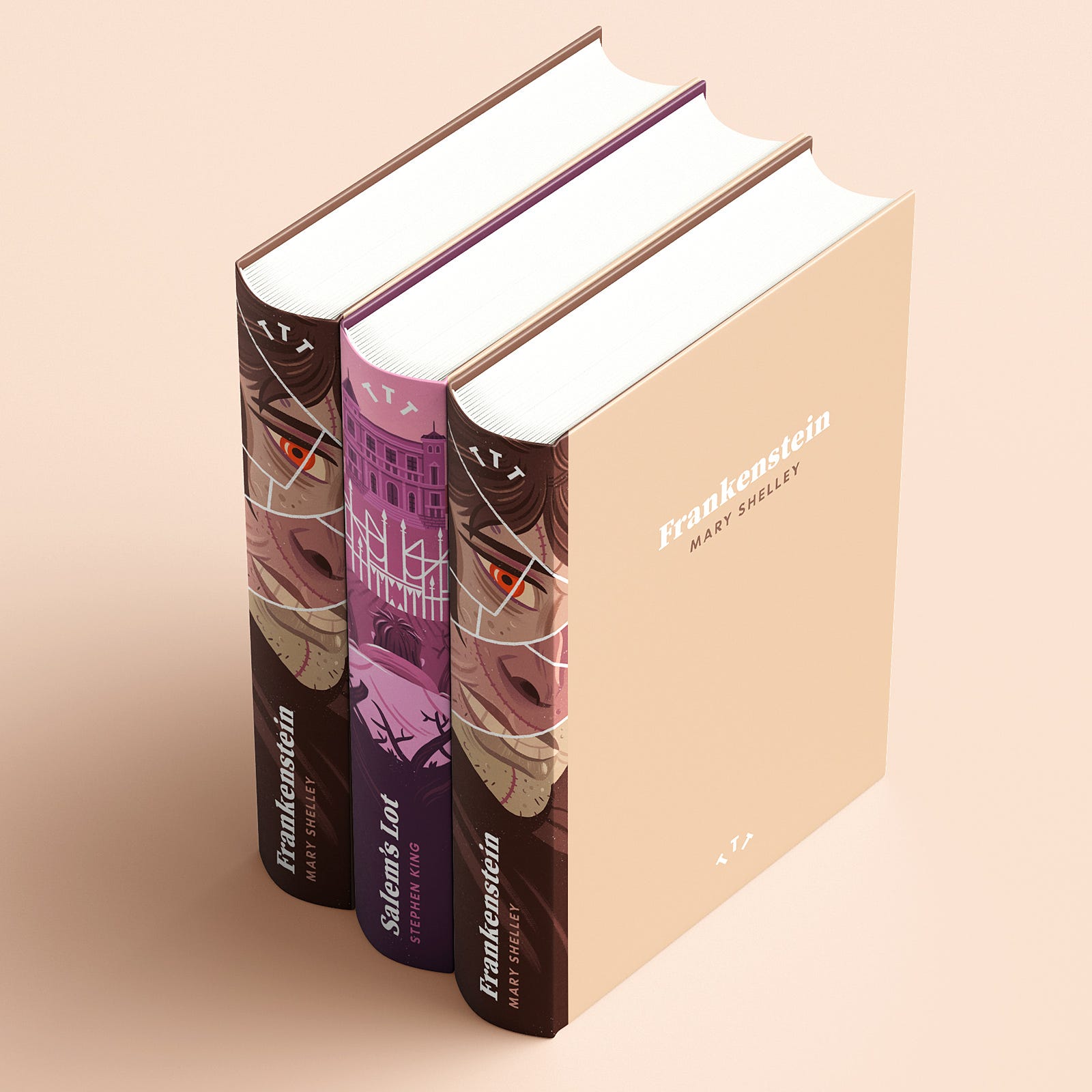
Three elements identified the spines:
A unified typographic treatment.
The main illustration.
A variable colour palette.
The use of prominent white lines that intervene in the design.
In the case of Frankenstein, these lines separated all the fragments of flesh that the doctor assembled, almost like a broken mirror. In the case of Salem's Lot, to create the fence that separates the Marsten House from the protagonist, representing the evil that lives there.
The spine design jutted out a few millimetres into the cover, and the rest was pure minimalism. Someone should award prizes to the books that best defend themselves with their spines on the hundreds and hundreds of shelves in a bookstore! 💪
→ More from the past
Inventory objects
It’s been a while since Dracula’s Trail of Blood (Cubus Games) was published. I remember how I unexpectedly enjoyed the creation of all the little inventory objects (around 18) and how it was a really smooth process.
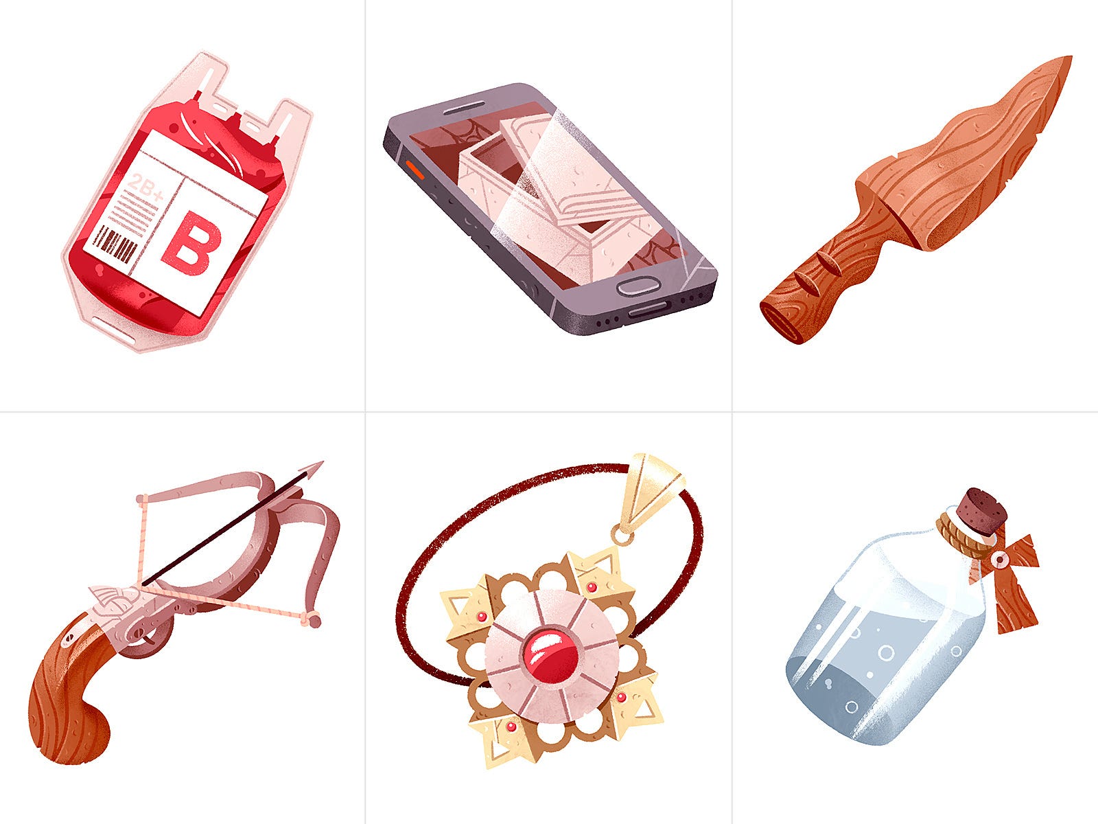
Will there ever be a second part? The result could only be infinitely better. Time will tell.
Reedsy team!
Do you remember the portraits for the Reedsy team page I shared some weeks ago? They’re already online. 43 of them in total (+2 unused ones). A very diverse team from all around the world: France, England, Colombia, Sweden, Spain, Guatemala, Bulgaria, Italy, USA, Portugal, India, Poland…
Solution
We replaced the previous, more iconic vector portraits, that were objectively easier to handle (scalable and interchangeable elements, identical generic features, etc) by a less abstract approach, looking for a certain degree of resemblance, which is unusual and hard for me.
So we certainly went for the most complex option. Which is cool, because it’s not the usual trend in these times. All of them are part of individual blocks including names, roles, location and a short description or fun sentence:

We also tried to incorporate personal elements in them. Some people wanted to show their pets or specific objects, while others preferred a more conceptual approach.

Behind the scenes
But let’s talk about the experience. In addition to the stress of not being an experienced portraitist, and although I am lucky enough to know quite a few people on the team personally, there are many others of whom I barely know anything more than their name.
It’s difficult to make a portrait of someone whose face you have seen once or twice in remote meetings and of whom you know nothing.
So, as is often the case, the best way to face difficult challenges is to embrace them. How about we turn this into an opportunity to make this mini project something enriching and fun?
I decided to have micro-interviews of about 3-4 minutes with various team members, at times that were convenient for them, so I could see their faces, chat with them (sometimes for the first time in our lives), get to know them a little and/or strengthen our ties.

It was nice to see how the quietest people in meetings can actually be very funny. Most people were excited to participate and think of a detail to include in their respective portraits. The conversations were more relaxed than in yearly retreats, due to the intimacy, and it was very pleasant altogether.
Now I can say that starting a conversation with 99% of the team is natural and requires no introduction. That can only bring good things. Do that, AI.
What I experienced drawing portraits (beginner level):
Complete objectiveness won’t lead you to a nice portrait.
If you don’t have a reference for a smile, improvising it will be extremely hard. An incorrect smile will make the person completely unrecognisable.
25-30% of the time was actually dedicated to drawing/painting them, and the rest, to all the small details and nuances that I couldn’t really get and that identify the person. An exhausting process that reminded me of my incapacity like twenty times per day. So much to learn.
Drawing pets and animals in general is tedious and uninteresting for me.
Thank you for reading In the Cave. Currently, I’m using social media just to promote this newsletter, share other people’s work or send memes to friends. Nothing else. So if you like this newsletter, please share it and recommend it. You can also find me on my website or Dribbble.
See you in the next (recommendations-only) one! The last one of 2024.
Read a previous story:

I love those spines! To your point about sales—I think it’s a particularly effective design approach for classics that need little introduction and can get away with experimentation.
And books like Frankenstein are in the public domain, so you could publish these yourself!
I just want to make sure that the comment about the spines— not good if you want to sell books— is irony. I buy more than one book because of the cover but a good spine is the cherry on the top.